
ISO news section revamp
Posted in daily
Tags :ISO soft-launched its revamped news section .
The idea behind the relaunch was to make this section more engaging and visually appealing, while integrating the different types of news items in a unified way.
Previously, the newsroom displayed 4 highlighted news items, a link to the archives and a list of topics to filter the news. Depending on the type of news (announcement, press release, ISOfocus, etc.) it would be found in different locations, and presented differently.
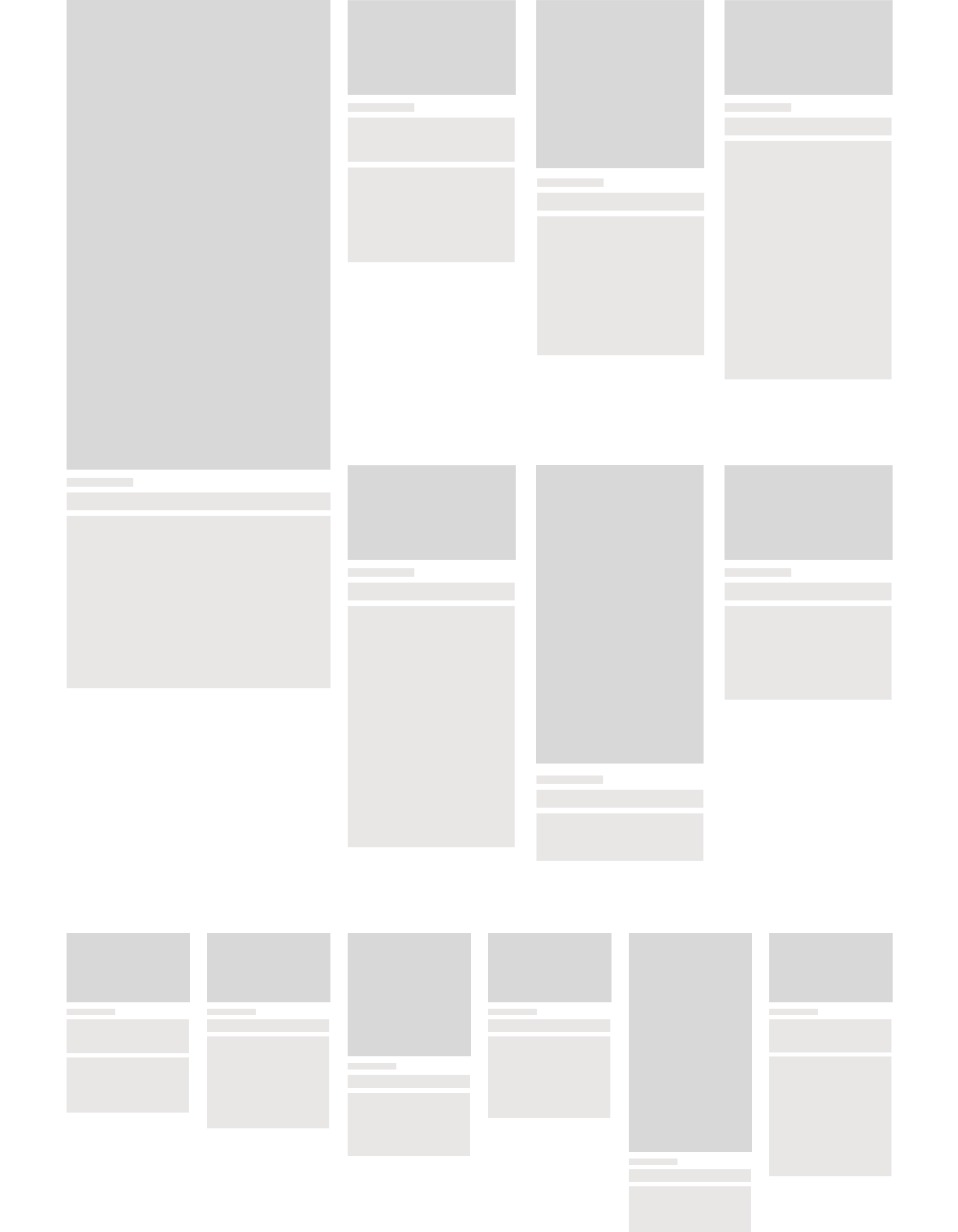
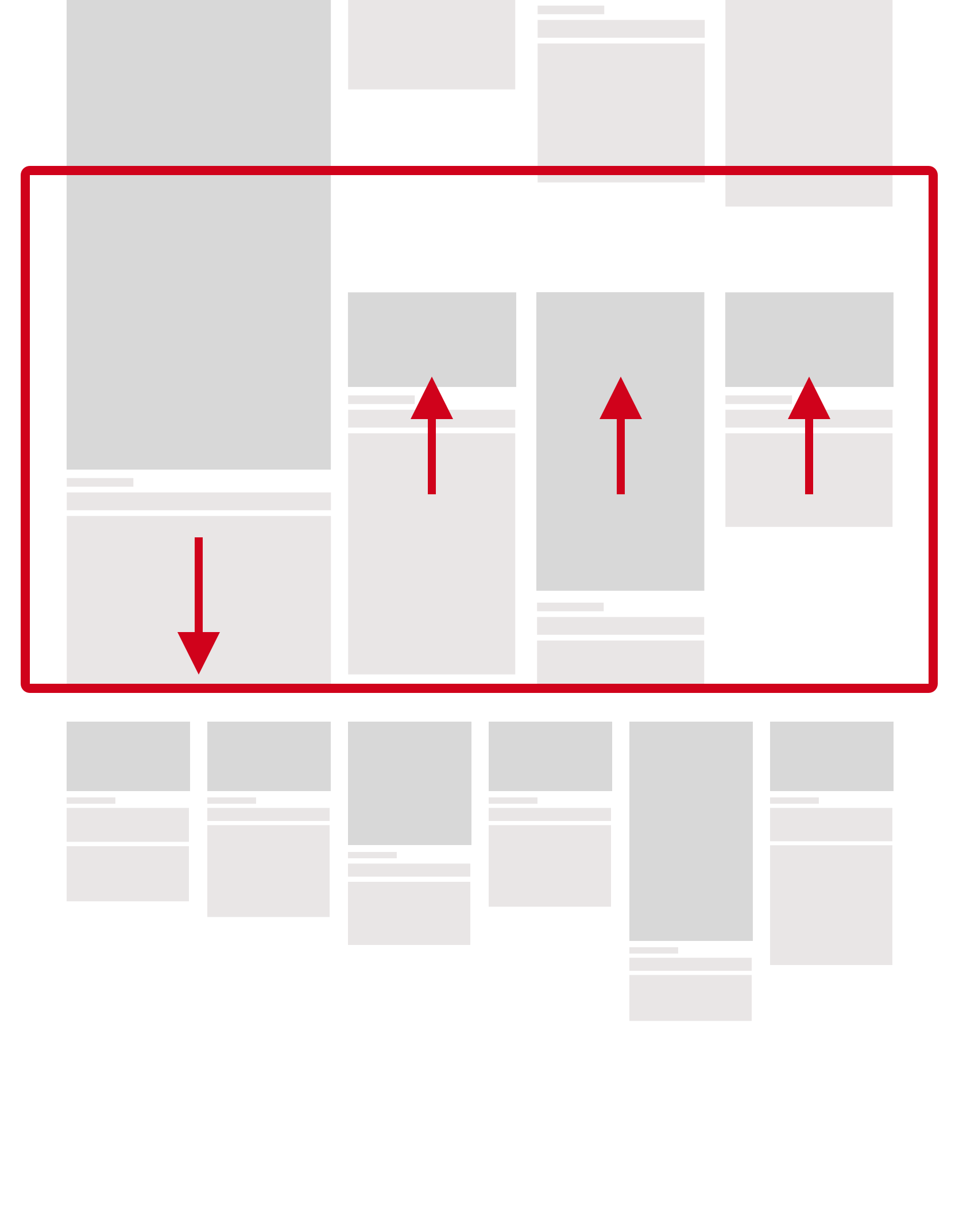
Infinite news grid
The relaunched news section is organised around a 12 cell grid, with a highlighted item standing out in the first cell spanning 2 rows (it sticks to top when you scroll). A load more button asynchronously adds 6 more news items to the end of the list as you click.
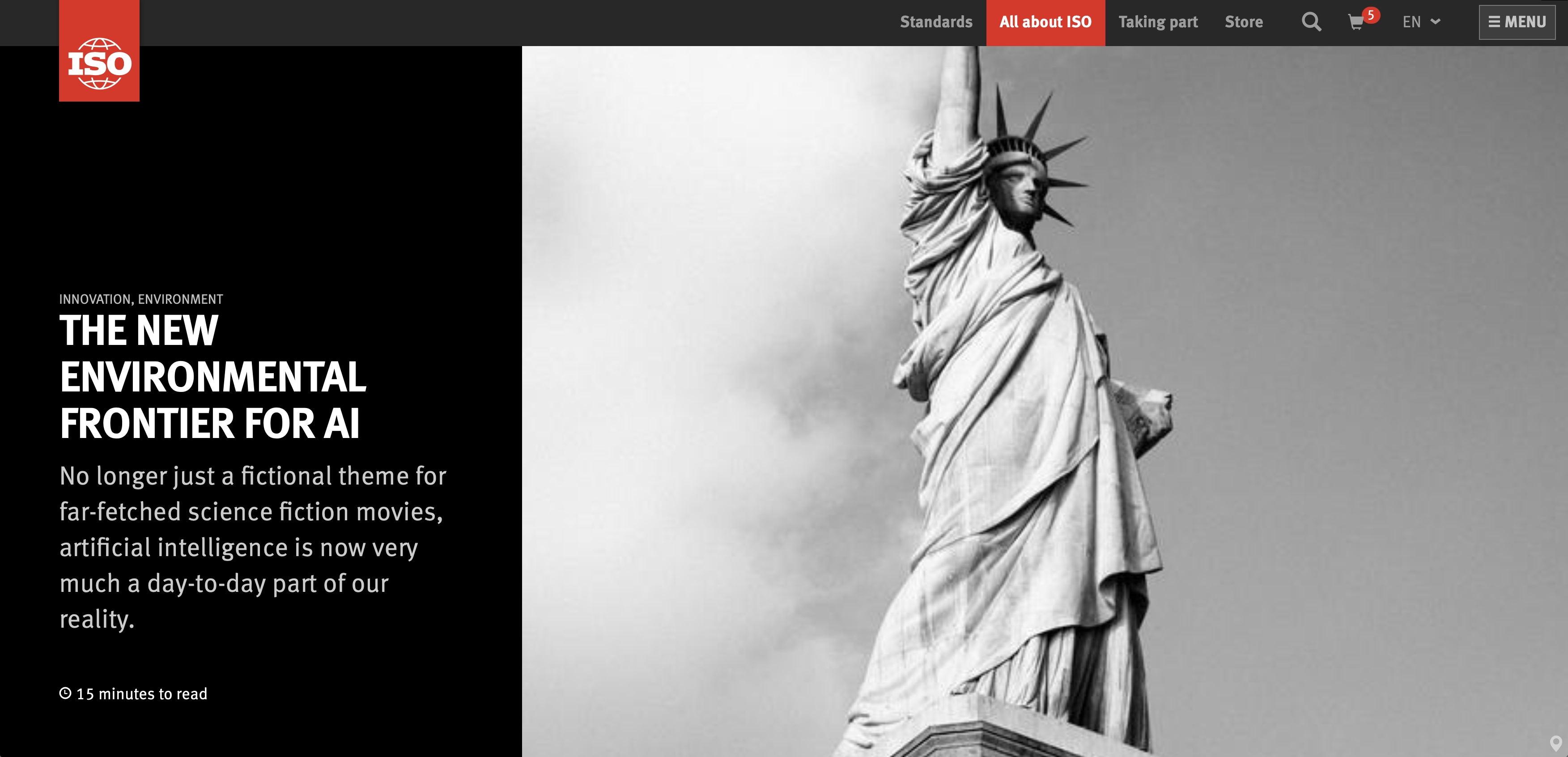
Each news item has a thumbnail image, a title, list of topics, date and excerpt. The various types of news items can be identified by the shape of their image. Long hand articles will have a large portrait image, while regular news and announcements will stick to a more traditional 16:9 image. Interviews will display a square image. It creates a discontinuity in the layout that calls for a more analytical examination.
The major topics (aka categories) are listed toward the bottom of the content area, and offer the same filtering that previously.
A slick and punchy header
The actual news page was revamped too. The challenge was to design a new layout and have it adapt gracefully to the thousands of existing news items already in the CMS without having to amend their content or assets.
There is a slew of new components and elements that are available to build and layout news articles (more on those later), but the most immediate changes are in the header and in the presentation of the meta data.
All types of news now share a common header layout. A large visual sets the atmosphere, while the title and part of the meta information are on the left. The proportions of each area change radically depending on the width of the viewport.
A lot of back and forth went into the underlying srcset as the image isn’t part of the background, as in building contingencies for long titles or lead paragraphs.
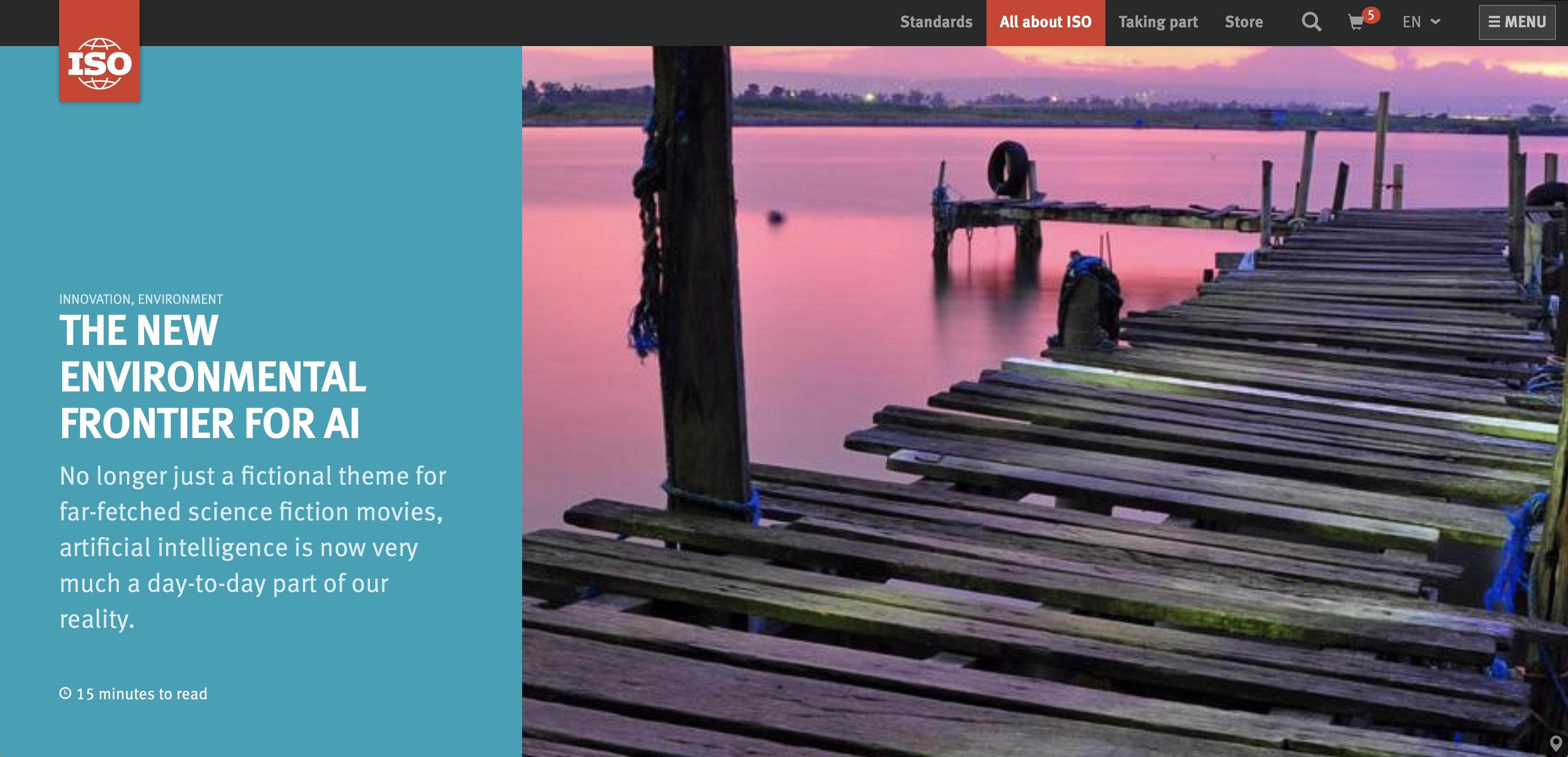
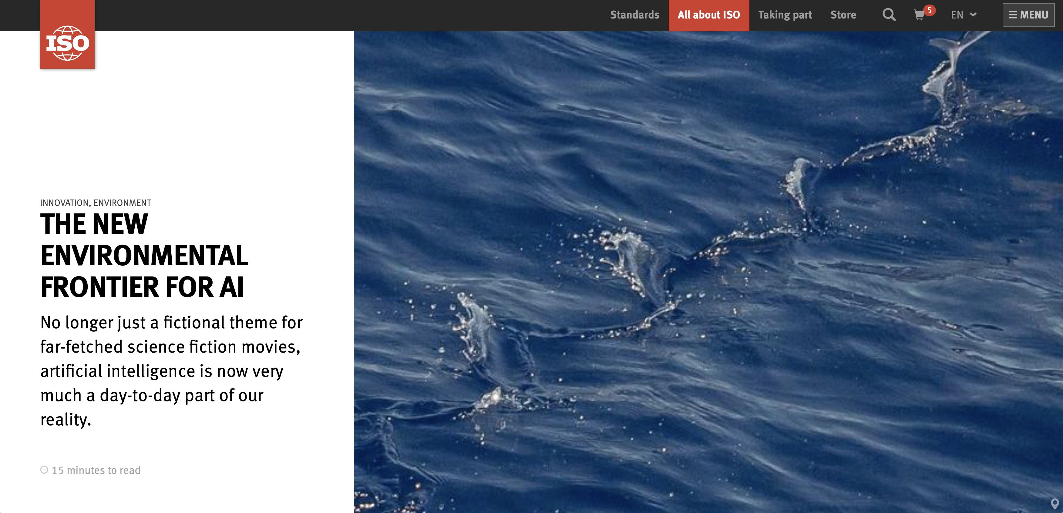
The background colour of the left pane if function of the type of news. for the time being we have:
- white on teal for long hand articles;
- black on white for regular news releases;
- white on black for announcements.

The meta section beneath the header for provides for additional translations on top of those provided, clear links to tag filtering and an indication of when the article was updated.
The overall result is a punchier and slicker design, that sets the atmosphere and feel hopefully more engaging and visually pleasing. Navigating the news should be more intuitive and easier (and faster too).
I can’t wait to see how the editors are going to use the new layouts and components available to them.
Again, congratulations to all the web team, and Lionel in particular, for your hard work and your legendary attention to details!
It’s an honour and a privilege to be part of your team and work with you on a regular basis!