Flickr has a new mobile app
Posted in daily
The other day, I was pleasantly surprised to discover that my Flickr app had a brand-new, modern look and feel.
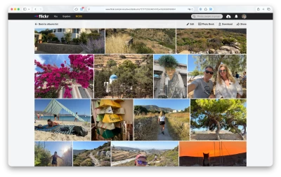
The UI is uncluttered and much simpler than the previous version. It embraces Apple’s Liquid Glass design language nicely. You swipe between your Following and Groups feeds.
I found there wasn’t much of a learning curve, as most of the actions from the previous version have been carried over (for example, double-tapping to favourite a photo). Then again, I wasn’t a particularly heavy user of the app.
I find that the current feature set covers the basics well. People on Reddit have been complaining that the image editing tools are missing, or that downloaded photos are too heavily compressed—two features I rarely, if ever, used.
I do miss one thing, though: I used to post to Flickr via the iOS Share Sheet after editing a photo, but Flickr no longer appears there. That’s a workflow I’ll miss while I get used to opening the app first.
As usual, change has generated plenty of discussion. Many Reddit comments focus on missing features (some genuinely absent, others simply moved or changed) or speculate that Flickr is trying to push users towards paid accounts.
Personally, I’m just pleased to see Flickr investing time and resources into rebuilding its mobile app from the ground up. Several Flickr employees have joined the discussions on Reddit, acknowledging feedback and reassuring users that this is only the beginning.
Fingers crossed.
My answer on How are we liking the NEW mobile app on Reddit:
I understand where many of the criticisms are coming from. At the same time, starting over with a solid foundation, even if it initially means shipping a smaller feature set and rebuilding from there, makes a lot of sense from an app development perspective.
Change is rarely popular, especially in a product with a community as large and long-standing as Flickr's. No matter what you do, some users will be disappointed, and that's simply the reality of evolving software.
For me, communication is the key. I'd much rather see an iterative approach, with regular releases and visible progress, than wait months or years for a big reveal--or, worse, no progress at all. The foundations of this new app look sensible and promising, and Flickr appears to be listening to feedback. As u/Lopsided-Lemon2029 said, "this is only the beginning."
I think the best approach is to be patient, acknowledge the effort that's clearly going into the app, and provide constructive feedback. At the same time, it's reasonable to expect continued progress and a steady release cadence.
A public roadmap, similar to what Glass provides, would go a long way towards setting expectations and reassuring users that missing features are planned.
I've been a Flickr Pro member since 2005, and it's genuinely encouraging to see this level of investment in the mobile experience. Flickr missed the mobile transition once; I sincerely hope they get it right this time.
My impressions of the new version so far:
- iOS: It's no longer possible to send a photo to Flickr directly from the iOS Share Sheet. That was my primary workflow, so I hope it returns soon.
- The download quality issue mentioned by other users needs to be addressed.
- Overall, I really like the new UI. It's clean, uncluttered, and easy to navigate, with almost no learning curve. Scrolling also feels fast and responsive.
- The maps are a noticeable improvement.
- Search is intuitive, and the advanced filters are both powerful and well organised. Defaulting to today's top photos is a smart choice.