
Safari for iPhone ignores viewport settings on .mobi domains
Posted in daily
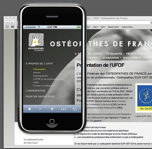
While working on the redesign of a client's website, I ran into a weird issue with Safari for iPhone: whatever device-width I specified in the viewport meta tag, the web site would render at 100%.
The viewport
For Safari on iPhone OS, the viewport is the area that determines how content is laid out and where text wraps on the webpage. The viewport can be larger or smaller than the visible area.
Safari on iPhone OS sets the size and scale of the viewport to reasonable defaults that work well for most webpages. The default width is 980 pixels.
For example, to set the viewport width to the width of the device, add this to your HTML file:
<meta name="viewport" content="width=device-width" />
If the webpage is narrower than the default width, set the viewport width to the width of your webpage accordingly:
<meta name="viewport" content="width=800" />
According to Apple's documentation «[..] the goal of Safari on iPhone OS is to fit the webpage in the visible area when completely zoomed out by maintaining a ratio equivalent to the ratio of the visible area in either orientation». So most, if not all, web sites are rendered correctly in Safari on the iPhone.
Except the one I was redesigning :/
After spending a lot of time debugging my markup and CSS, I gave up, and postponed this issue to later, concentrating of the website redesign itself. Launch time approaching, this issue stuck out more and more on my todo list, until half an hour ago.
dotMobi
Well it turns out it has all to do with the domain's name TLD: .mobi (dotMobi). I chose this domain to develop the website on while the current one was running on its .com TLD. The switch would be easy enough come launch time.
I have never taken much time to look into dotMobi since it launch in 2006, but according to its Wikipedia entry «dotMobi does not itself mandate any particular technology, but does require that .mobi sites produce user experiences consistent with their guidelines and specifically optimized for mobile phones». I would never have imagined that a browser would treat a website differently based solely on its TLD.
The only other available browser on the iPhone (Opera Mini) renders it as a normal web site. It's only when I thought to load the web site using its IP number instead of its domain name that I understood what was going on.
I suppose this makes sense from a default behaviour point of vue: the site is supposed to be optimised for mobile viewing, but I don't understand why the viewport settings aren't taken into account if they are present.
Feeling relieved, I needed to share this info with you.