GCBHR website launch
Posted in daily
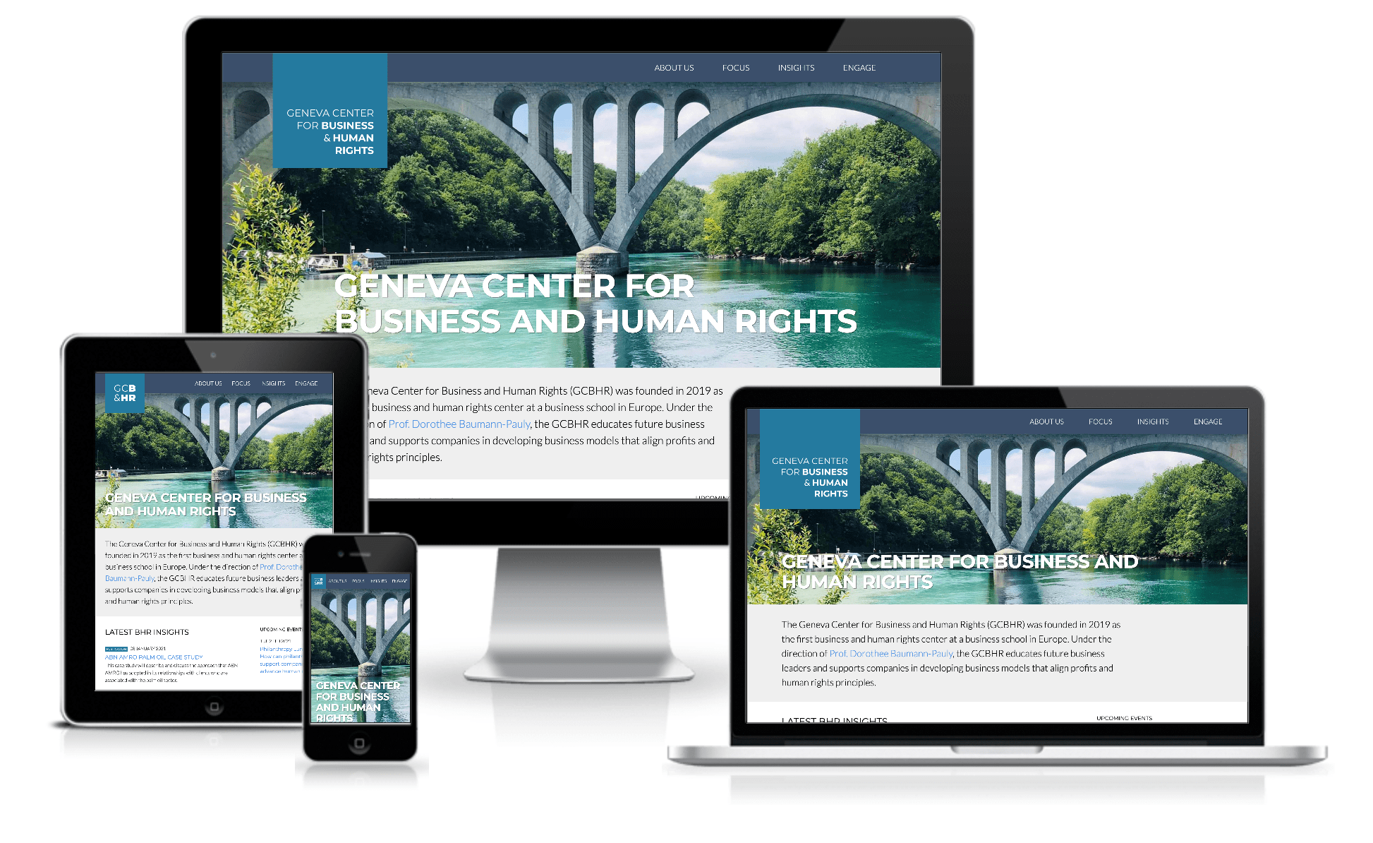
Tags :The Geneva Center for Business and Human Rights launched their new website !

The centre was founded a little over as the first business and human rights centre at a business school in Europe (University of Geneva / GSEM).
The GCBHR under the direction of Prof. Dorothée Baumann-Pauly educates future business leaders and supports companies in developing business models that align profits and human rights principles.
Pascale approached me last spring to ask me if I would be interested in helping them design and build their website. I soon discovered a new field I had never heard of: business education. The GCBHR is at the crossroads of academic research and business practice and harbours a deep commitment to human rights. A truly multidisciplinary approach.
Over the past months, I tried to design and build a website that meets their expectations and gives them the tools they need to communicate on their activities and reach the audiences they target. It was very much a team effort, iterating on numerous designs and patterns to reach the initial version of gcbhr.org. In these COVID times, we never met in person to work together, it was all done over Zoom or Basecamp, which has its limitations.
I am honoured and grateful to have been part of this adventure, and would like to share a few things I learned or built along the way.
Responsive logo
While the team was gathering content and working on the information architecture I suggested, I set off to tackle the branding, typography and logo. I decided fairly early to go for a square logo with an emphasis on business and human rights (check out my initial branding presentation for more insights on the process at that moment in time).
Designing in Sketch was all very well, but I felt that a demo page would be better suited to (remotely) illustrate how the logo adapts to the width of the viewport. So I coded an HTML/CSS version of the logo with media queries to illustrate how it could change according to the viewport:
Colour schemes
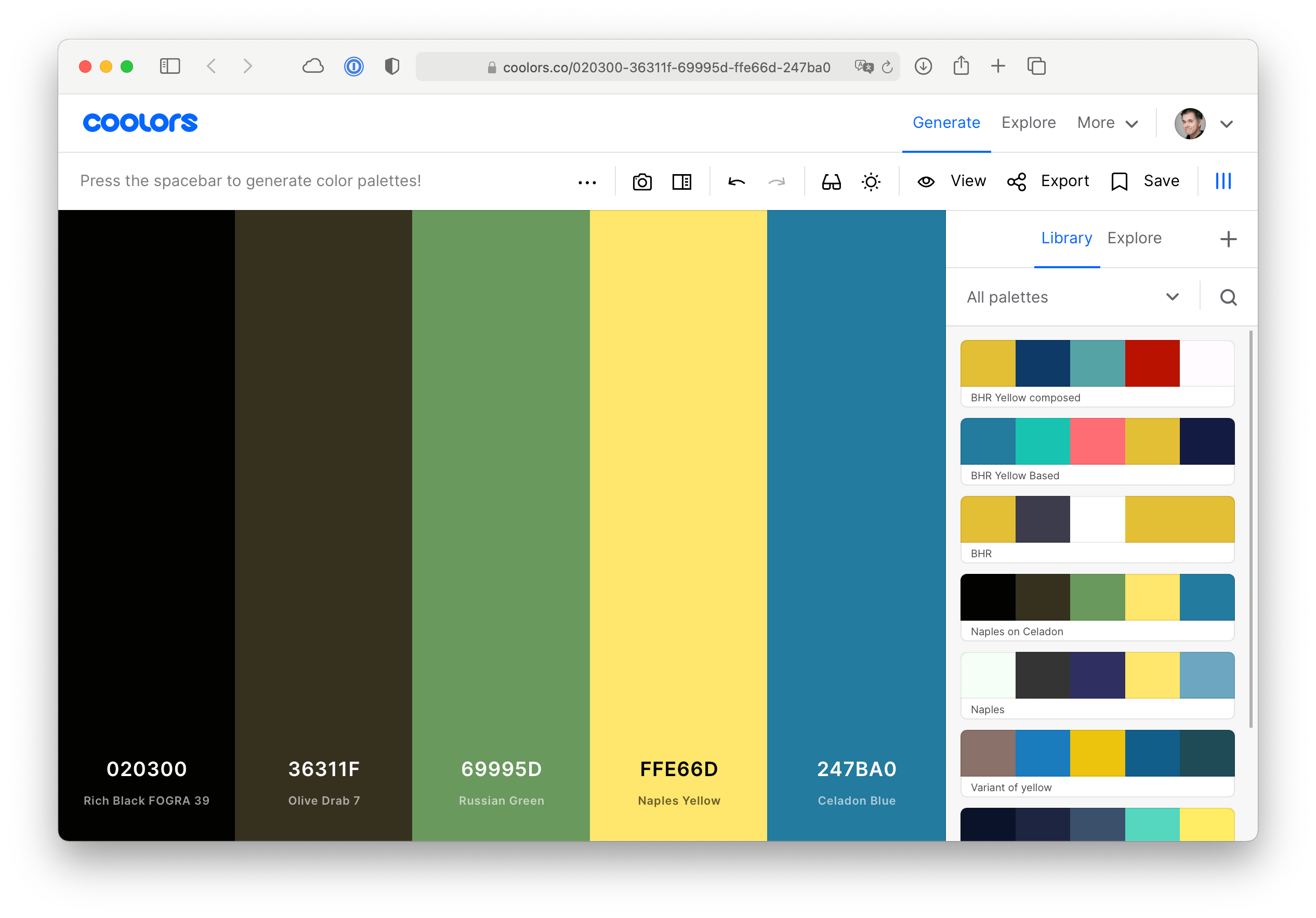
I used coolors.co to build a starting set of colour schemes.

Logo colour picker
Choosing the primary brand colours turned out to be more challenging than I had anticipated, so I built a dynamic logo colour picker to help us test the various colour combinations:
Templates and components
The website is driven by Perch Runway, my favourite content management systems along with Kirby. I tried to document the different components I designed in a set of reference pages to help the editors layout their content. This is no means a style guide per se, but more of a set of usage examples of the available content blocs.
A page is composed of stacked bands that can hold different component sets (text content, media card, media grids, etc.).
The page header evolved to become very flexible : it can display a hero image, with an overlay title and lede paragraph, or not. The navigation, logo and grid adapts to each combination.
The Insights section as well as the Cobalt Knowledge Hub are driven by Perch Runway’s collections (the same way the tags are).
The different components and layouts were very much driven by the content. This is a very text driven website, so the typography choices and reading experience were the first to be made. I find that integrating and using real content in the design process is the best (only?) way to go forward. Adapt or develop a new view or template when a new layout or component is needed. Perch Runway is the ideal CMS for this kind of situation.
Finally, the website is hosted at Infomaniak, my favourite hosting and internet service provider.
I am looking forward to helping the GCBHR adapt to its new challenges and to continue to collaborate with the dynamic members of its team. Godspeed!
New year, new look!
— Dr. Doro Baumann-Pauly (@DoroBauPau) January 28, 2021
I am thrilled to present our new website: https://t.co/UnrHWJcJM1
Have fun learning more about our work and please sign up for our newsletter! #bizhumanrights #Teach_BHR @NYUSternBHR @wbcsd

