My initial thoughts on the macOS Big Sur redesign
Posted in daily
Tags :
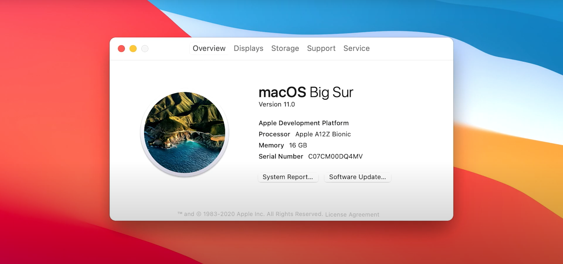
I found ’s WWDC 2020 Keynote quite overwhelming in terms of what has been announced. Maybe it is due part to its new format. Pre-recording every segment enabled them to deliver a tighter packed keynote, or maybe it’s just that there was a lot announced.
The system wide redesign of macOS is what got me thinking the most these last couple of days. Now, macOS is my favourite operating system, and I always get excited by a system redesign. So, I’ve stopped to have a coffee on a terrasse on my way to work, and share my initial thoughts.

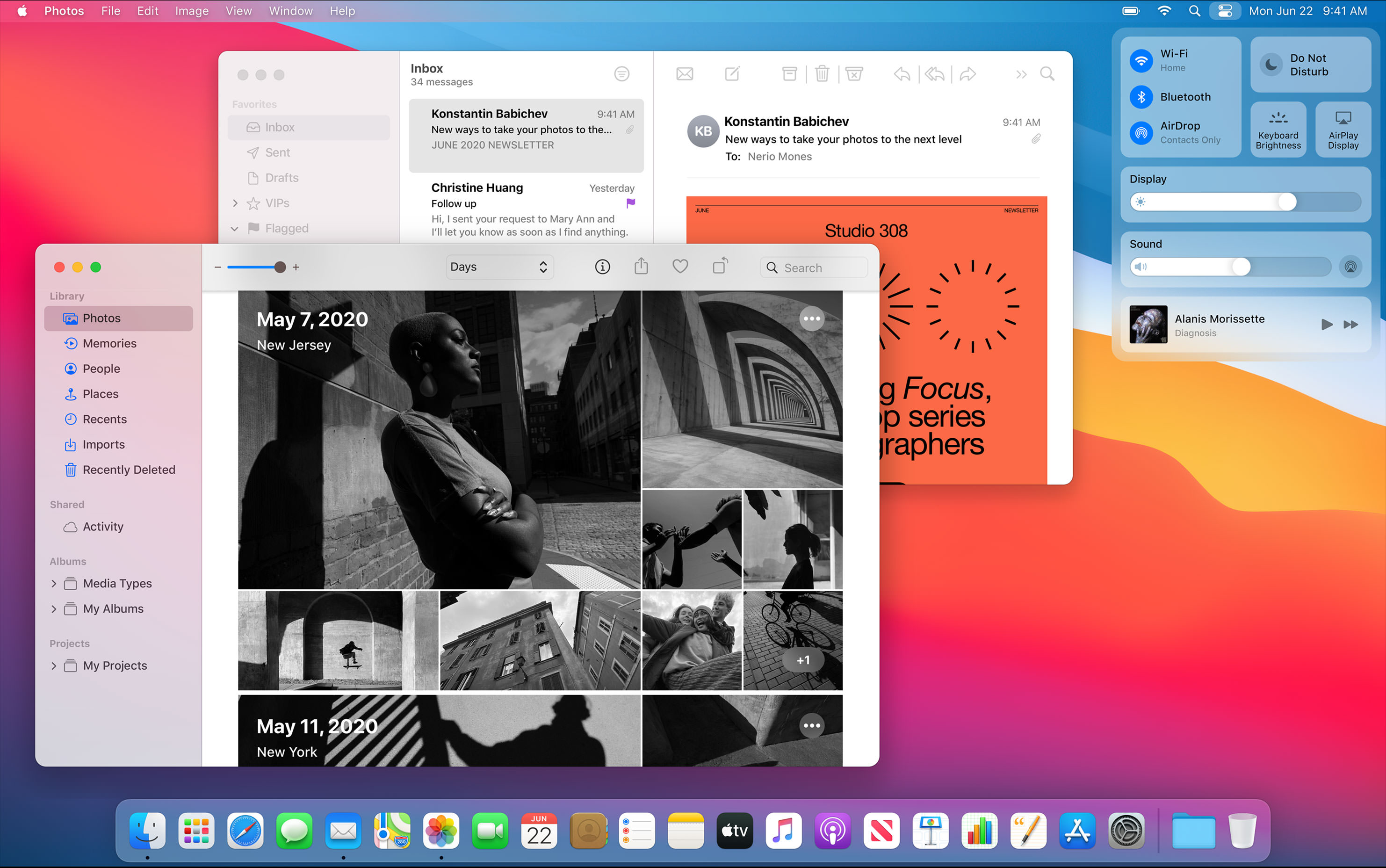
What struck me first was the reveal of the translucent menu bar. Duh!? I think it first appeared in Mac OS Leopard, and was accused of stealing CPU/GPU cycles for rendering. You could turn it off in the next release of Mac OS, but in 10.5 you had to modify a plist file.
Next, many iPad OS features have appeared on the Mac, especially those related to displaying (or masking) controls, as well as an increased use of translucency and rounded corners. The hover effects are similar to those introduced recently with the trackpad and mouse support in iPad OS. Let’s just hope accessibility and usability won’t suffer from it.
There is no denying the hardware convergence we are seeing today in Apple’s platforms, but macOS 10.16 macOS 11.0 (!) confirms a software convergence many have been suspecting for years now.
And why not? It remains to be seen that macOS won’t be worse for it, but platforms can retain their specificity and look related. iOS and iPad OS feel similar, but have growing subsets of specific features.

I couldn’t help but imagine how many more times I am going to accidentally touch my Mac screen now when working on my MacBook Pro and iPad side by side. Some controls are identical.
The spacing between controls looks bigger too, as do title bars (menu bar?) or dialog box buttons (has Big Sur embraced iOS centred dialog boxes?). Moreover, the Dock looks like iPad OS’s twin brother.
Rounded corners dominate in the UI and on Apple’s product page. It seems that only the actual screen corners remain square (I believe Mac OS Classic had rounded screen corners, no?).
Could this be the first step towards a touch enabled Mac…?
Anyway, I haven’t installed the developer beta of Big Sur yet, but I have the feeling I might not resist installing the public beta this year, especially considering we aren’t going anywhere this summer.
Exciting times.
Update : it has been confirmed that Apple is bringing back the startup chime it began to jettison with new Mac computers as far back as 2016.
