Retrofitting responsive design
Posted in daily
Tags :The BIS launched their retrofitted responsive website today. Congratulation to the @BIS_org web team!
This was a project I worked on this Winter throught to Easter. The idea was to preserve as much of the current website as possible while making it responsive to mobile devices.
The challenge was to design a CSS stylesheet with media queries with some custom JavaScript while editing as little of the HTML markup as possible.
The website had been redesigned fairly recently, and they didn't feel the need for a full redesign. There would be no content update or review and no visual design either. They were to stay as is. So over the course of a few workshops in their premises, I made an inventory of the website's components and designed how they should behave at different viewport widths.
Navigation
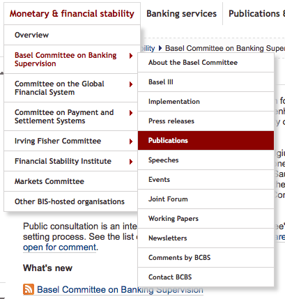
The main challenges were related to navigation. The main navigation has entries and 3 levels dropdown on the desktop width. That's a lot. This generates long breadcrumbs…

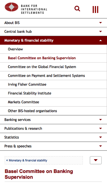
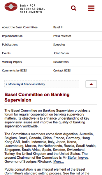
This was solved by pulling out the third level navigation. The main menu was display the first and second levels in a expand/collapse fashion, and the third level would be available via a toggle switch when it existed. The best place to put it turned out to be next to the breadcrumb.
On narrow viewports, the breadcrumb was trimmed to display a link to the parent level only. This mimics the back button behaviour and is immediately understandable. For more options on third level links (our current level), expand the third level navigation by clicking on the arrow next to the breadcrumb.


Navigation: 1st and 2nd levels

Navigation: 3rd level
Layout
The three column layout was easily tackled as its content was used systematically throughout the site (second level navigation / main content / aside content). These could easily be linearised.
The search is a important navigation tool and had to be easily reachable whatever screen used. So placing it up the top was the ovious choice. Custom CSS and a sprinkle of JavaScript fixes its behaviour.
Toolbar
The upper right toolbar was the only markup that required a major markup change. Webfonts were used for icons and the whole block was moved down in the page footer. Absolute positioning moves it up on wider viewports.
Otherwise, some custom jQuery, Modernizr, and a couple of IE conditional comments took care of gluing everything together. It was a fun project to work on and the BIS team did a brilliant implementation. Congratulations to all :)
