
Polishing my dark mode toggle
Posted in daily
Tags :Earlier this year, I finally added a proper theme switch to the navigation of my website. Up until then, if relied on the visitor’s system’s setting prefer-color-scheme and didn’t provide a convenient way of switching between themes other than via a link in the footer to turn dark mode on.


- Building a theme switch component by Adam Argyle
- The Quest for the Perfect Dark Mode Toggle, using Vanilla JavaScript by Bramus
Setting the page’s theme colour
The theme colour of the page can be set in a couple of ways.
- Honouring the system appearance preference
{ light | dark | auto } - Reading the web site’s user settings from localStorage
{ light | dark }
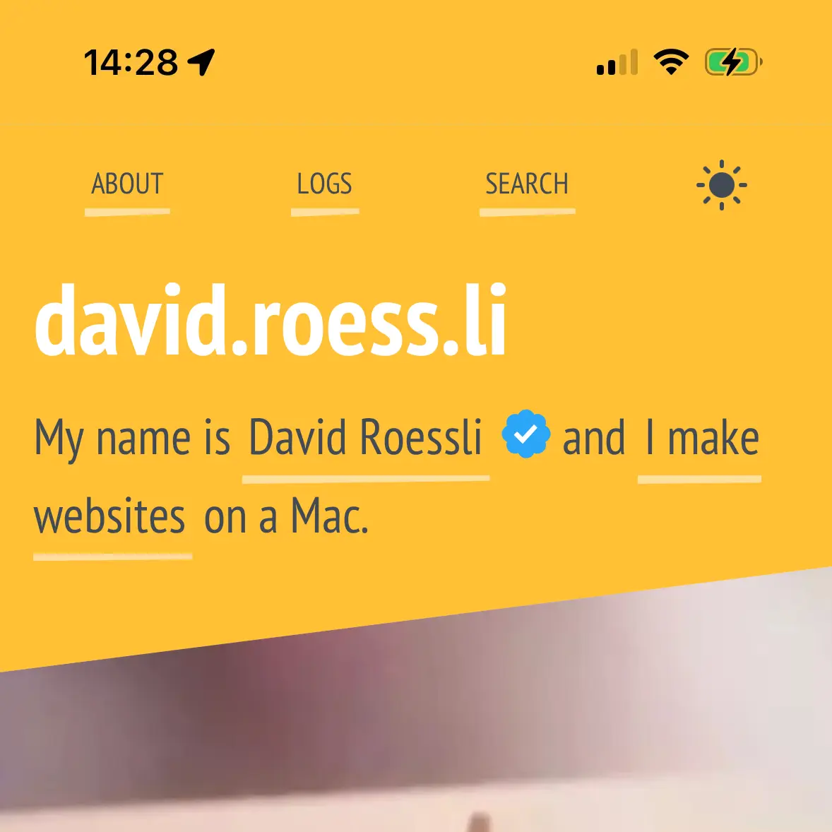
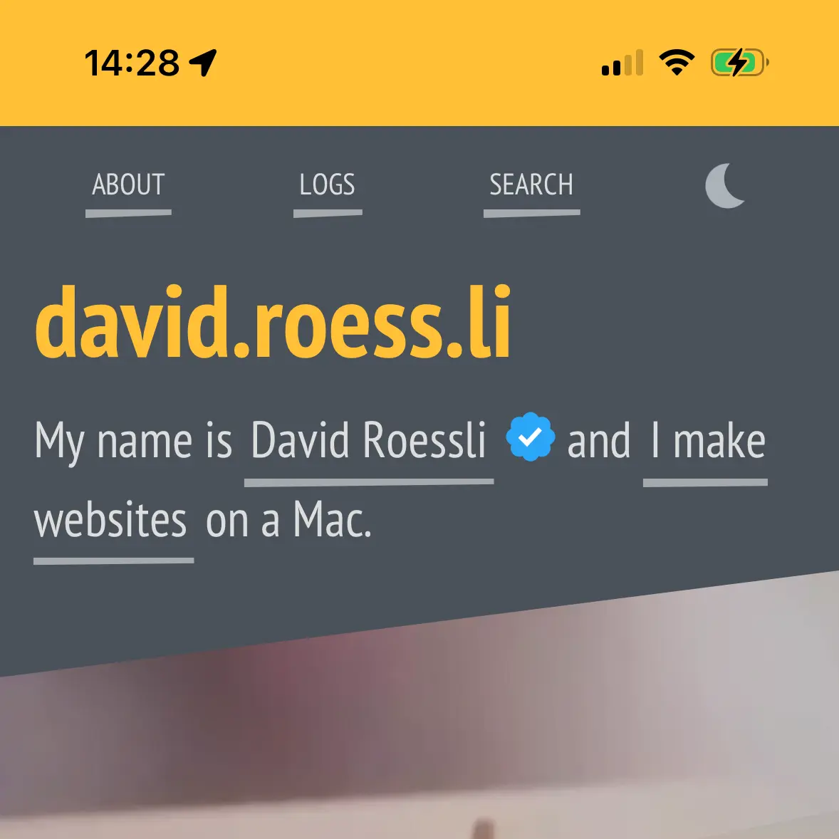
The challenge is to honour the visitor’s preferences while avoiding a flash of colour if the setting doesn’t match the default. My website defaults to light, but if the visitor has set his preferences to dark, the dark theme must kick in as early as possible to prevent a flash of yellow.
The theme is set via a data attribute in the html element data-theme="{ light | dark }".
<html class="js page page--post" lang="en-GB" data-theme="light">
<head>
    <meta charset="utf-8">
    <meta name="viewport" content="width=device-width, initial-scale=1, viewport-fit=cover">
    <meta name="mobile-web-app-capable" content="yes">
    <script src="/js/theme-toggle-min.js"></script>
On page load, a small JS script checks the browser’s localStorage for existing preferences and sets the appropriate theme if present. If absent, it checks the visitor’s system preferences and sets the theme accordingly.
Why theme-color is important on mobile
The two blog posts mentioned above [1] cover more or less my thought process on the matter, so I’ll refer them to you if you’re interested in the innards of it all, but they left out one detail that has its importance on mobile: theme-color.
The theme-color value for the name attribute of the
<meta>element indicates a suggested color that user agents should use to customize the display of the page or of the surrounding user interface. If specified, the content attribute must contain a valid CSS<color>.
Source: MDN
The head section contained the theme-color element along with the prefer-color-scheme media query for both themes.
<meta name="theme-color" content="#ffc036" media="(prefers-color-scheme: light)" />
<meta name="theme-color" content="#4a525a" media="(prefers-color-scheme: dark)" />
But it turns out that if your system preferences are set to ‘light’ and you switch to ‘dark’ via the theme toggle, the surrounding user interface remains in ‘light’ (as specified above).
This can be fixed by adding a plain theme-color value with no media query attribute that can be changed via the theme toggle script.
<meta name="theme-color" content="#ffc036" />
<meta name="theme-color" content="#ffc036" media="(prefers-color-scheme: light)" />
<meta name="theme-color" content="#4a525a" media="(prefers-color-scheme: dark)" />
The toggle switch script is a little less elegant now as I had to hard code in the colour values, instead of just relying on a html data attribute value (light | dark).
I considered reading the prefer-color-theme media queries values, but they aren’t loaded yet when the script runs. A way around could be to default to the light value and store the current colour value alongside the visitor’s preferences in localStorage. I need to give it a try.
The theme can be fully changed via the system settings or by clicking on the toggle switch, whatever the initial settings are.
Reset switch
What is still missing is a way to reset or revert to ‘Automatic’. As soon as you click on the toggle switch, the setting is saved to localStorage and will prevail over the system setting.
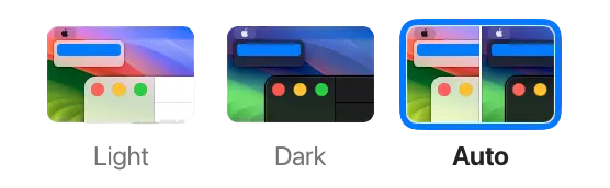
This could be an issue if the latter is set to ‘Automatic’, but there is no way of determining for sure if the visitor has set its system preferences to ‘Automatic’, but prefers reading this website in dark (or light) mode - or clicked to try the themes, but prefers the website honouring the system preferences. The toggle would require an ‘auto’ mode, but it wouldn’t be a toggle anymore, it would be a dropdown menu.
For the time being, I added a (hard to find) link in the footer area to delete the localStorage value basically just for me.
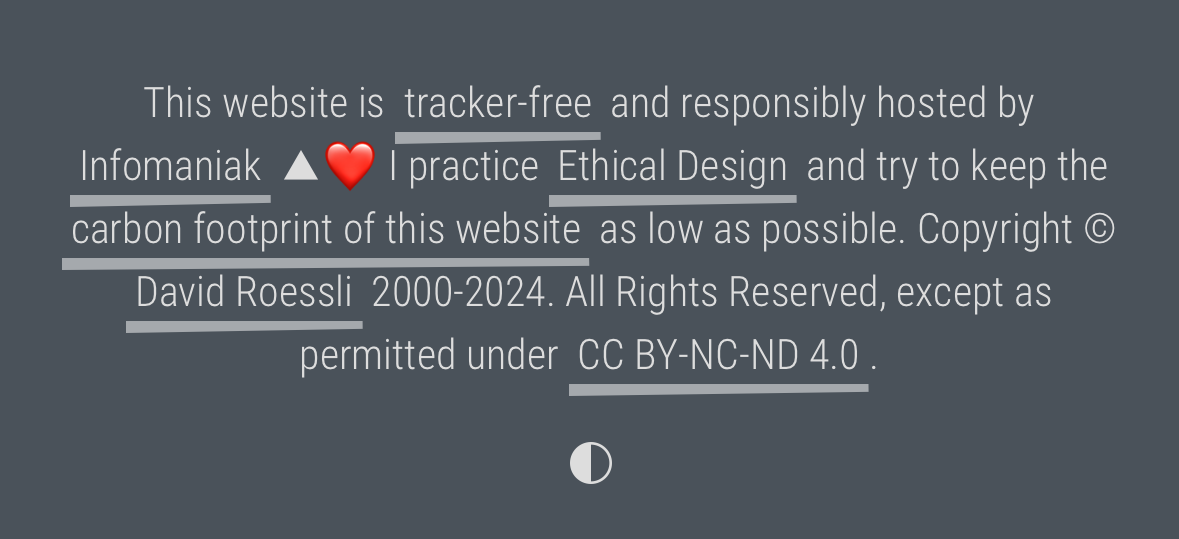
The bottom icon only shows up if a localStorage theme key exists, and deletes it when activated.
I’m contemplating the idea of extending the toggle to a 3 position switch:
[ light → dark → auto ]
It wouldn’t be discoverable, and wouldn’t function as 2 state toggle, but could do the job, while being more elegant than a dropdown menu, which is the obvious answer in this case. Some judicious microcopy would b required.
Anyway, for the time being, I’m enjoying a modified version of the beautiful toggle switch component designed and developed by Adam Argyle, I shamelessly borrowed it from his blog post.
For now, I’m off to the Montreux Jazz Festival to enjoy the fabulous Raye live 💜 Enjoy your summer ☀️