Organising my iPhone Home screen
Posted in daily
Tags :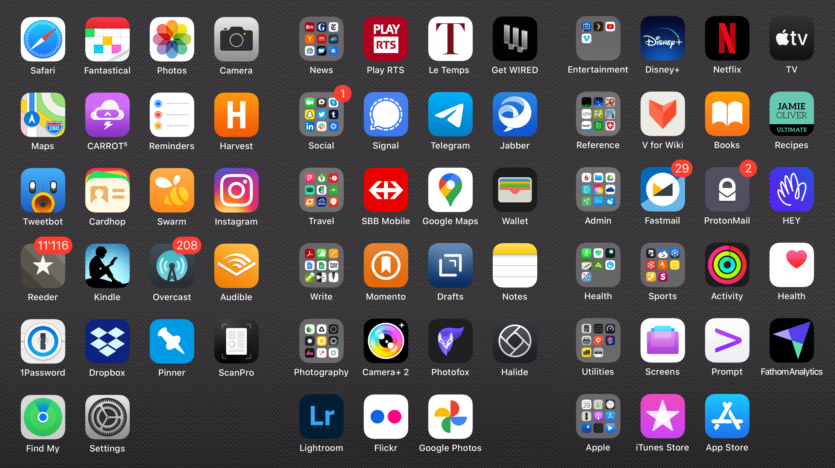
Among the major features of iOS 14 announced at WWDC, were App Library and Widgets, both of which impact how your SpringBoard (or Home screen) is organised and how you access apps.
I have always enjoyed ordering my iPhone home screens and posting them to Flickr to keep track of the evolution. I guess I must be a little obsessive-compulsive as I have 285 apps organised over 6 iPhone screens. Anyway, I love app icons, and ordering them is part of the iPhone experience for me.
Home screen
My Home screen (first screen) displays my favourite and most frequently used apps.
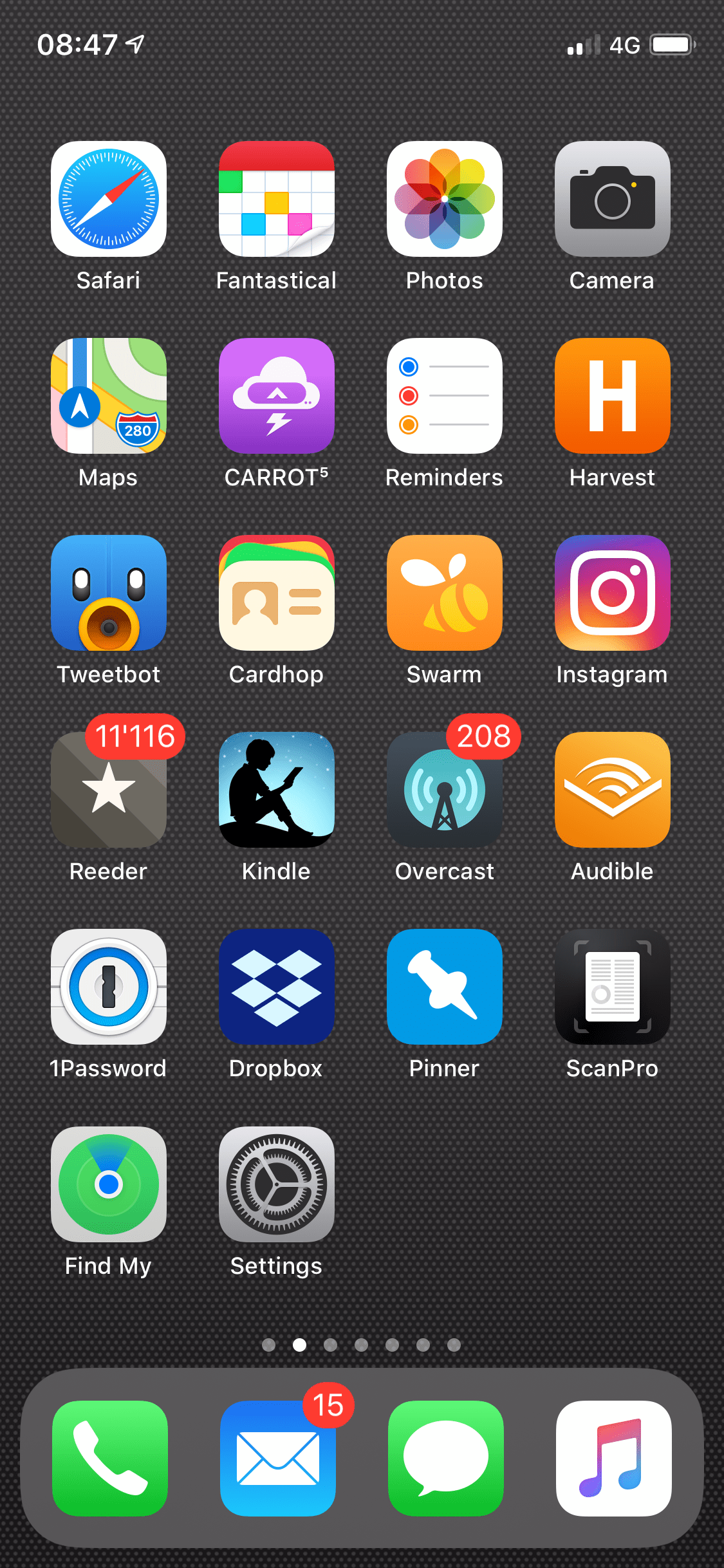
The Dock hosts the apps I want to access from everwhere, and hasn’t changed much over the years. Its composition and order remains close to that of the original iPhone’s, except for Messages that replaces Safari. My first row of apps has remained the same over the years, and again matches closely the first iPhone’s (with swapped Safari and Messages).

Corners are premium. Safari, Camera and Settings populate those on my Home screen.
I leave empty slots on all my screens to enable reordering of apps, which can be a real pain as they tend to fly out to the next screen and offset all the apps and folders…
Folders
When Home screen folders were introduced in iOS 4 I quickly adopted them as a way to order less frequently used apps of a category on the same row as those I use daily.
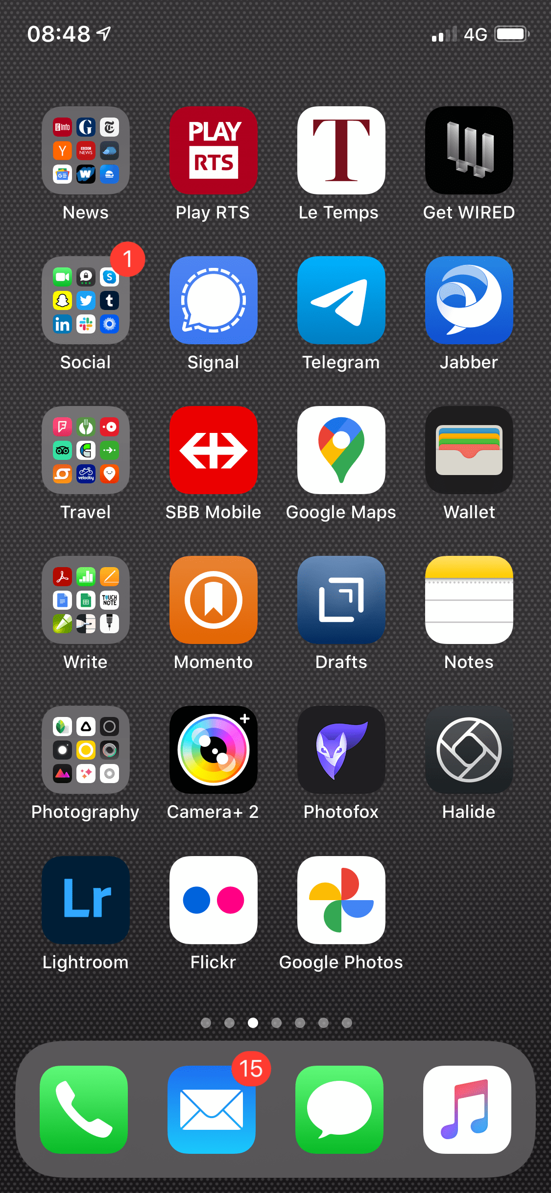
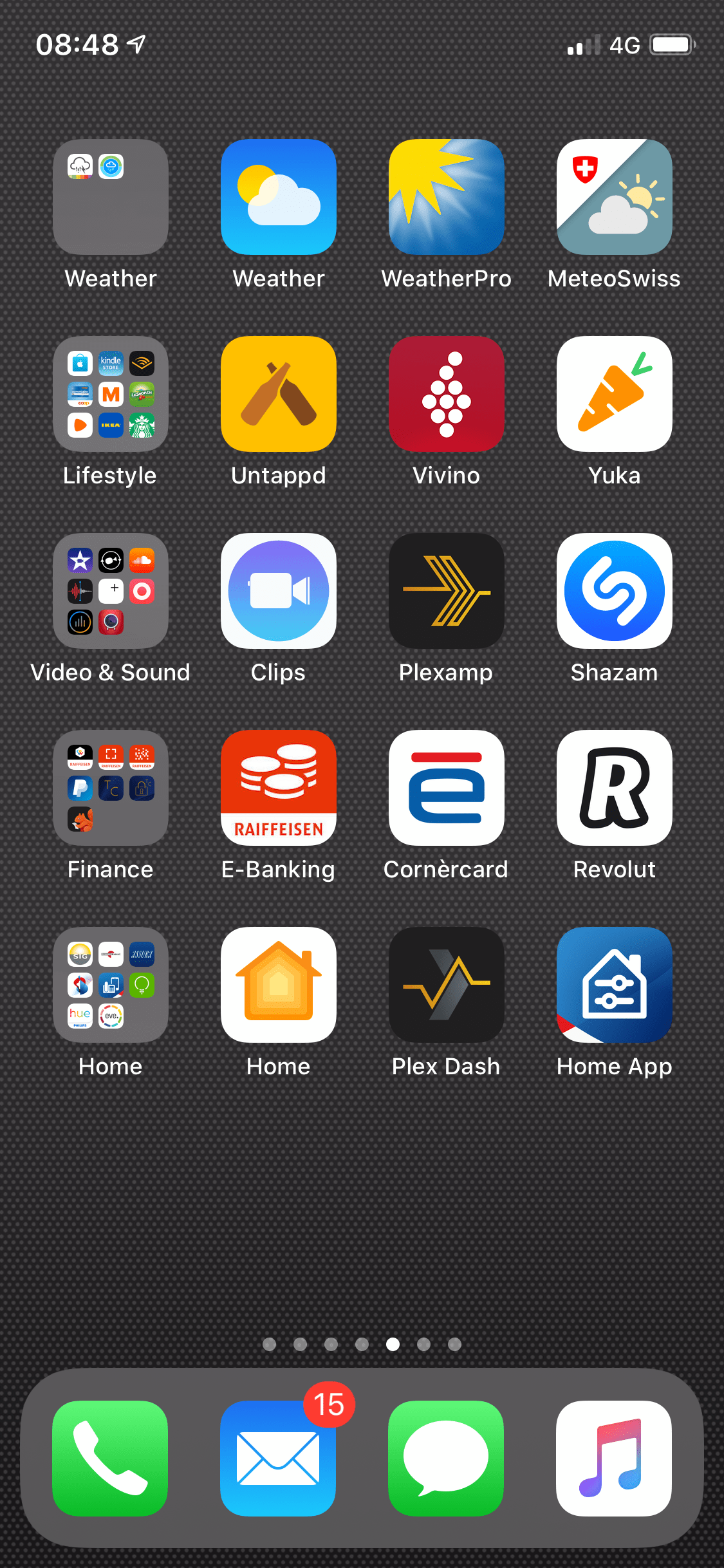
So, for instance, my second screen hosts my News, Social, Travel, Writing and Photography apps. Having many apps of this last category (40), I’ve often been tempted to give it its own screen, but I didn’t want to multiply my increasing number of screens.
Folders lineup on the left-hand side of the screen. This approach works well on the iPhone screen as it doesn’t rotate (except for Max models). It was a problem on the iPad before iOS 13 as the number of apps per line changed depending on the screen orientation.
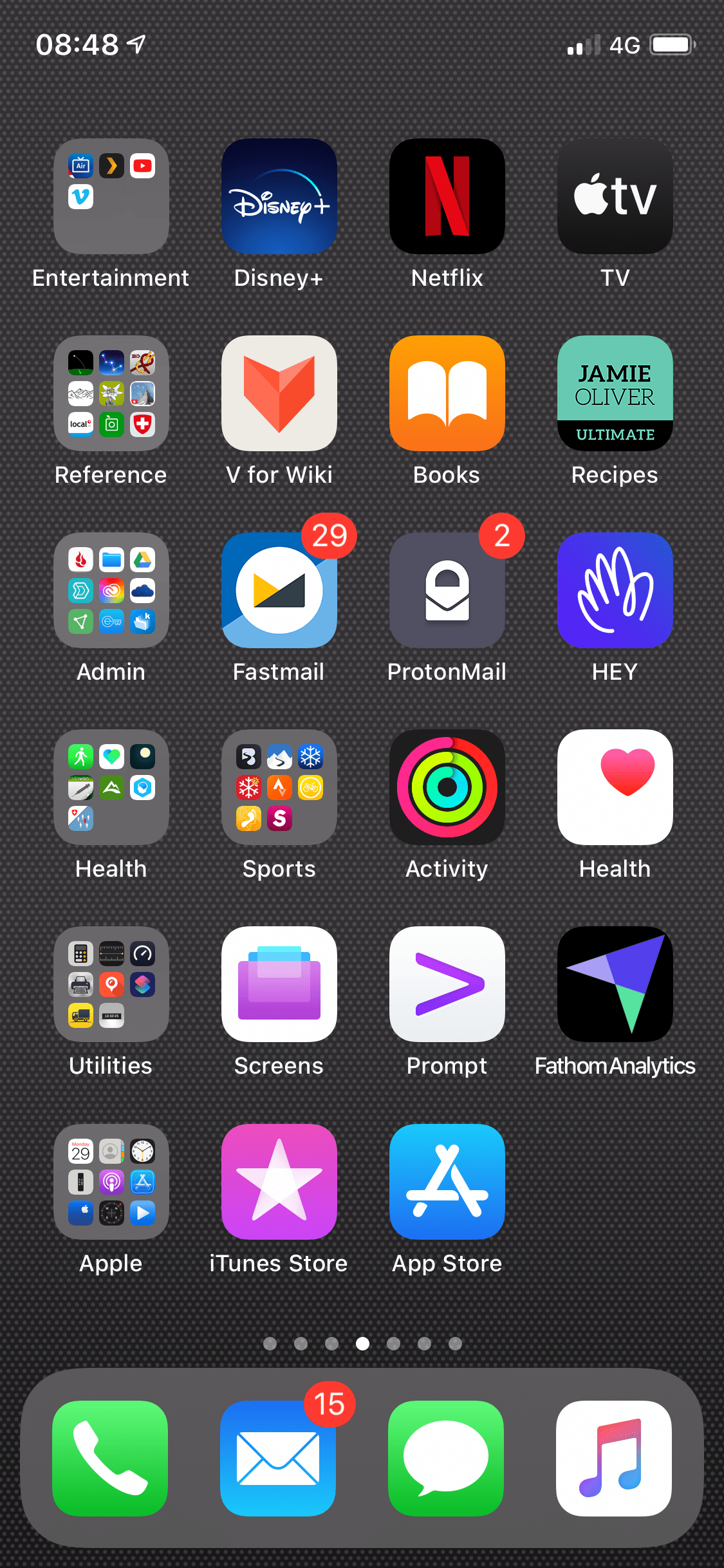
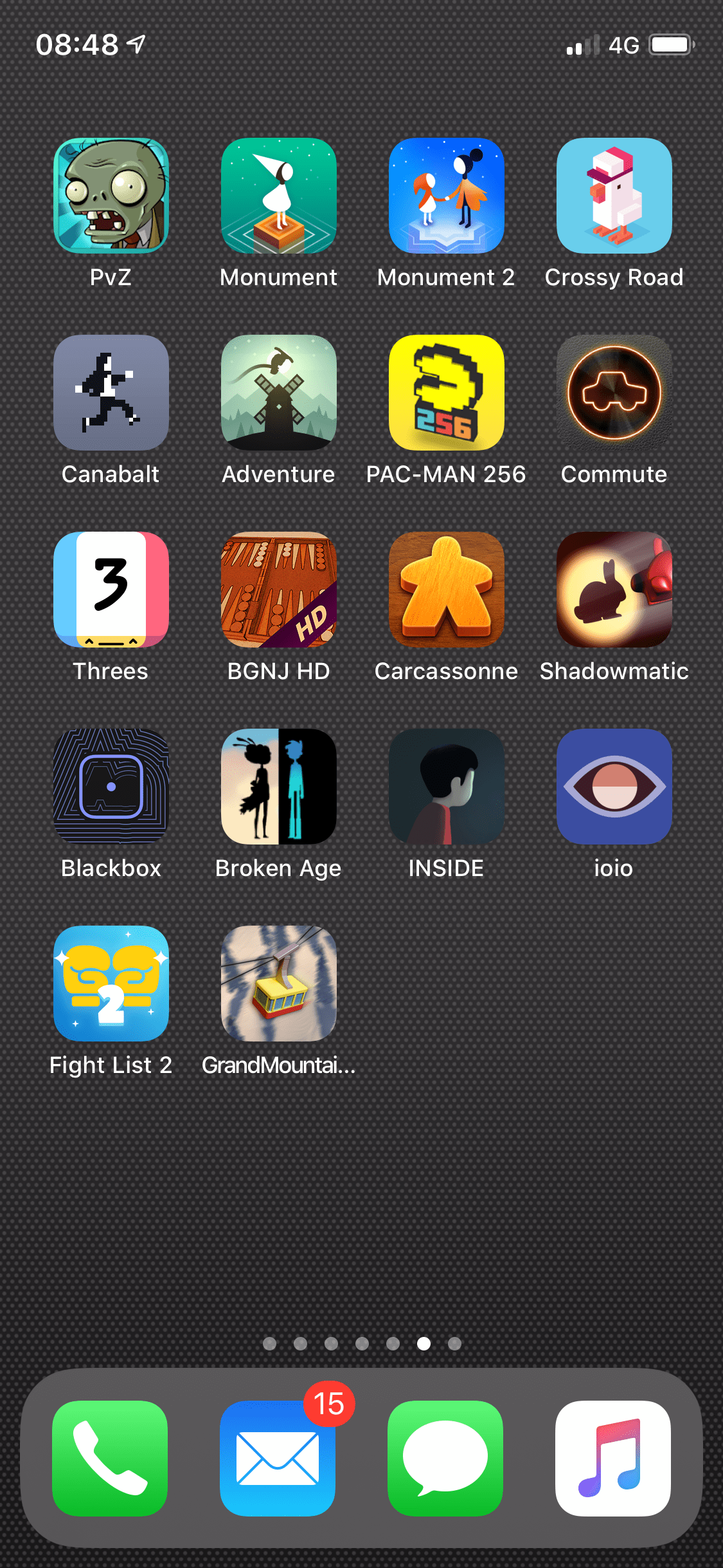
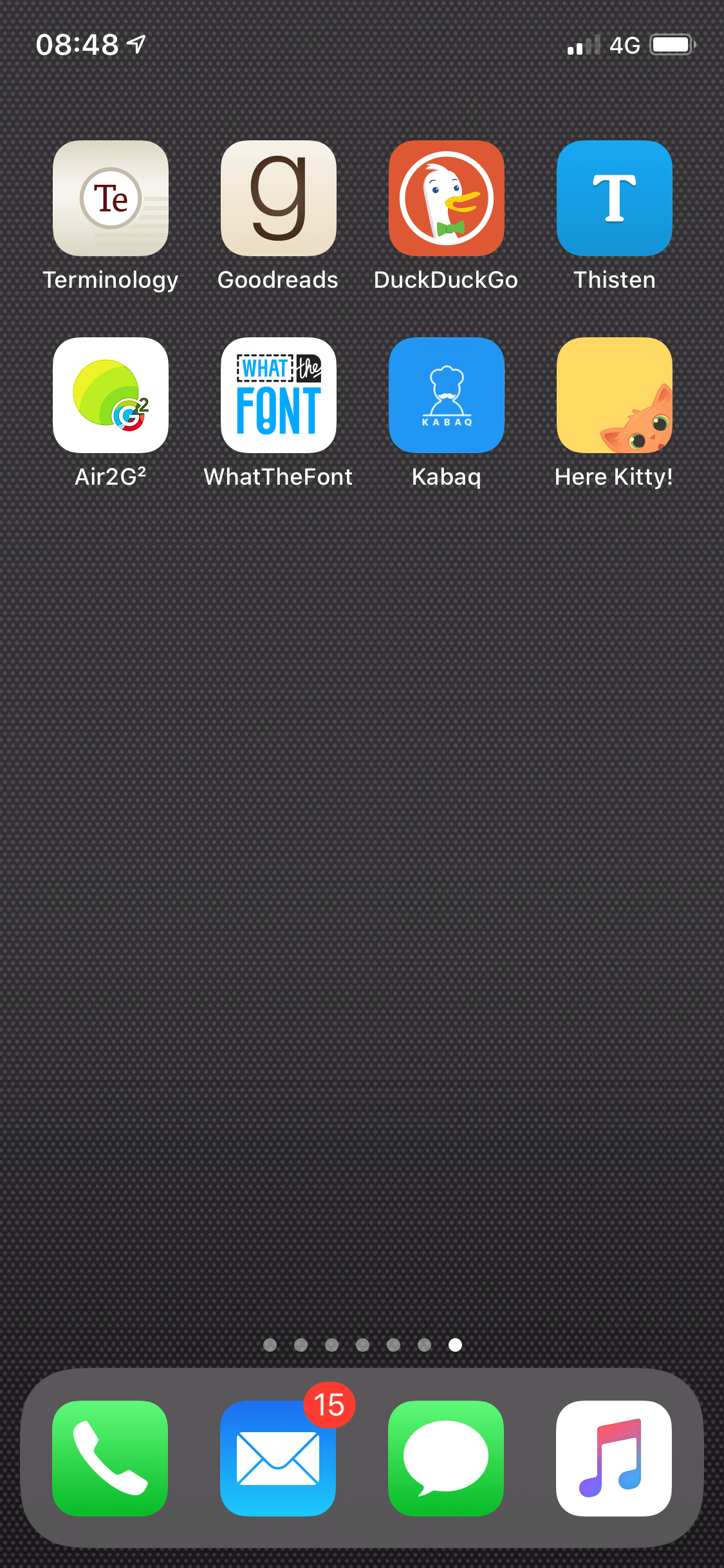
I reserve a screen without folders to games as I like to see them all laid out. I am not much of a gamer, but I like my classics and I like to try out new ones. It also fixes a limit on the maximum number of games I have at any given time.
The last screen is devoid of folders too and is devoted to new or temporary apps I’m trying out. If I decide to keep one, it then migrates to the screen and row of its category.
It’s a simple an effective way of ordering my apps while trying to keep the number of screens as low as possible.
Needless to say, I am looking forward to trying out Widgets and App Library to see how they fit in my touch of OCD 😉
Tip: How to reset the Home screen and apps to their original layout
- Go to Settings > General > Reset.
- Tap Reset Home Screen Layout. Any folders you’ve created are removed, and apps you’ve downloaded are alphabetically ordered after apps that came with your iPhone.
