Web Trend Map v4
Posted in daily
Tags :Information Architects Japan (iA) have published their annual Web Trend Map (v4) which lists the top 50 most influential domains (333), and the people (111) associated with them onto the Tokyo Metro map.
The domains and people are selected by the iA research team based on their own set of criterias. The result, eventhough subject to discussion, is astonishing.
Overall, the content is very anglo-centric - is this a surprise? - both in the domains selected and the people. I was surprised not to find the BBC or Al Jazerra on the broadcasting line. On the other hand, how do you decide what is important in cultures/languages you don't share or speak? I have very little insight in the Asian views and usages of the web. I don't read african or chinese weblogs and I am not subscribed to any japanese RSS feeds. I guess the ISPs have usage stats that provide leads to a the global view, but a better image could maybe be provided by the users themselves. I think this is the approach iA partly adopted.
Information Architects Japan are the guys who wrote that great article «Web Design is 95% Typography» back in 2006.
I especially enjoy the mapping skills that have been deployed to produce this map. I can spend hours just navigating through it. I admit, visual display of quantitative data fascinates me. I'm a sucker for maps and graphs.
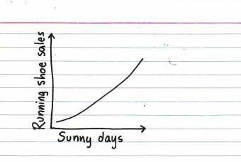
I love Jessica Hagy's Indexed weblog { PUBLISHED WEEKDAY MORNINGS as the COFFEE BREWS } which delivers fresh and unusual ways to apprehend the current zeitgeist through a line or pie chart. Funny and very creative. Spring and good intentions,
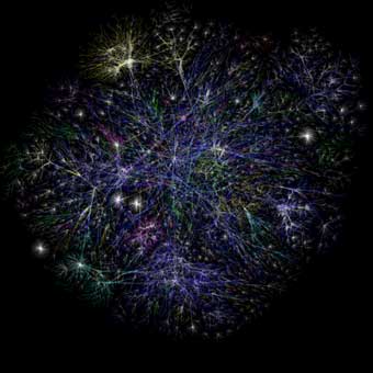
I remember ordering the first Map of the Internet from ThinkGeek back in 1999 and being captivated by its exploration (just like the one Vint Cerf showed at Lift 2009). The Opte Project offers visual representations of the Internet, quite like my 10 year old map. Map of the Internet, Jan 2005,
It was about at the same time I discovered the works of Edward Tufte, an expert in the presentation of informational graphics such as charts and diagrams. »Visual Explanations: Images and Quantities, Evidence and Narrative», «The Visual Display of Quantitative Information» are all time favourites of mine. Just up my street.
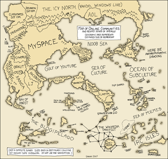
More recently, I found interesting visual representations at xkcd (A webcomic of romance, sarcasm, math, and language), namely a map of online communities,
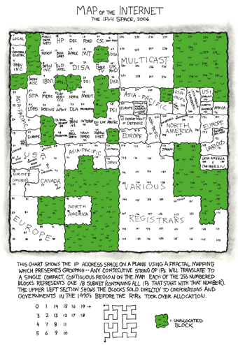
Or a map of the internet IPv4 space 2006,
Anyway, all this to tell you to check out iA's latest revision of the Web Trend Map. Enjoy.

